I’ve added a new page in the navigation menu at the top that features custom label designs I’ve created for my homebrew. While all of these labels were designed by me in Photoshop, some were created with the help of generative AI. Check them out here, and let’s talk about them!
If you scroll from the bottom up, you’ll see the progression of my graphic design journey—from when I first returned to homebrewing up to now.
In these designs, I’ve experimented with various methods of organizing and prioritizing information. You’ll notice my sensibilities and aesthetics have shifted over time, and I expect they will continue to evolve.
Early directions
In the beginning, I toyed with the idea of assigning each beer a rarity — like you’d find in loot drops for video games like Diablo, Borderlands or Destiny. This is still a really exciting idea to me, but in practice I found it difficult to implement in a way that didn’t feel completely arbitrary. All of my beers are rare by nature of being homebrew: they are not sold in stores, only shared with friends and family. They are also brewed in “small” 3-gallon batches, so then what would make one more “legendary” or “common” than another?
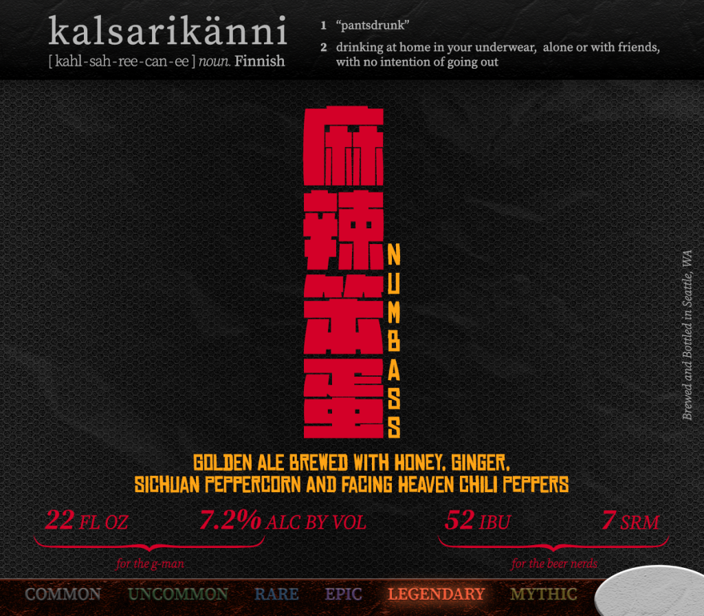
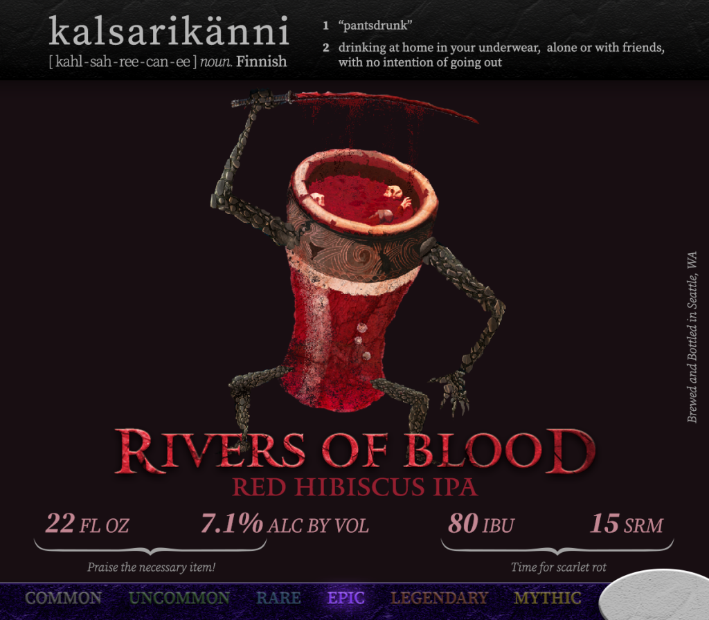
Early on, I treated each label as a unique piece of artwork, with almost no consistent typography except for my brewery banner at the top, and some of the beer stats near the bottom. Each label was a new canvas to evoke an idea or a mood associated with my beer. Some of these designs still feel very special to me because of this, but it became more and more difficult to “reinvent the wheel” with every new label. Over time, you’ll notice that I started to standardize my typography to create a more cohesive look.
My kalsarikänni banner has undergone the least changes of all. I knew I needed to define the word because most people would not know it. After a half-dozen labels, I added the word “brewing” to clarify this was not the name of the beer, but the name of the brewery.
Removing extra details
At first, I included a lot of statistics on the labels, such as volume, alcohol by volume, original gravity, final gravity, yeast attenuation, IBUs (bitterness), and SRM (beer color). However, I quickly realized that including the volume meant I’d need to create different versions of the label for different bottle sizes, so I dropped the volume almost immediately. I kept the other stats for about a year before deciding that these numbers were really only important to other homebrewers, and almost meaningless to anyone else.
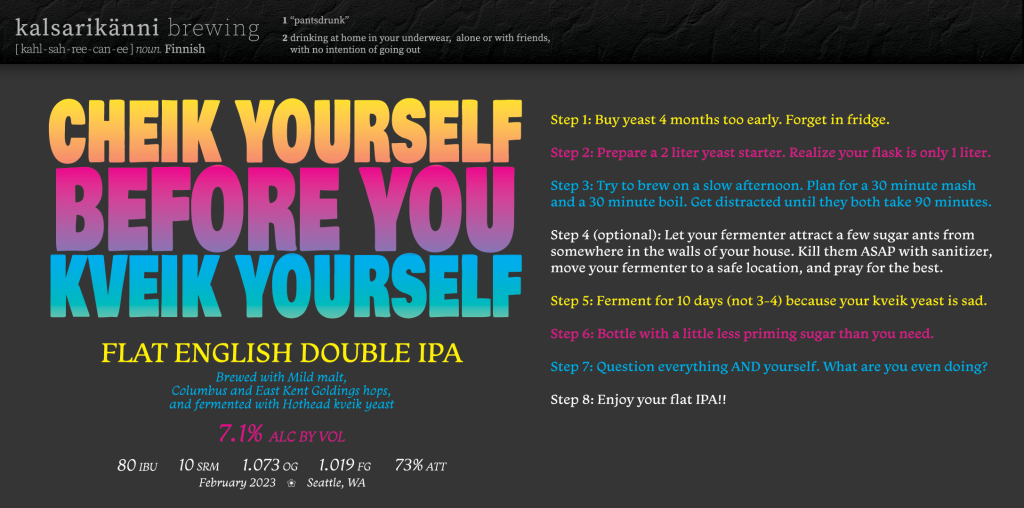
I also had a short paragraph detailing the grain bill, hops and yeast used in each brew. I felt this was more valuable to non-brewers, especially if unique fruits, spices or herbs were being used. Even if you didn’t know the differences between various malts or hops, this description could paint a rough picture of what the beer was.
However, after a year or so, I found myself drawn towards minimalism. So I removed that as well, leaving just the name of the beer, the beer style (most of the time, but not always), and the ABV.
You could say this is when I started designing the labels just for me.
The murkiness of Gen AI
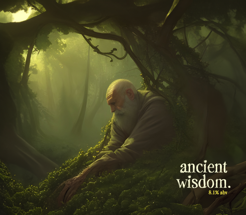
Around this time, I started experimenting with generative AI in Photoshop. I think anyone familiar with Adobe Firefly, Midjourney or DALL-E should be able to quickly identify these labels. As I mentioned in my third post, the use of AI felt icky and problematic to me, but I also thought it was a worthwhile experiment to test the limits of its capabilities. Since these labels were just for me, I could at least learn first-hand where AI shined and where it fell flat.

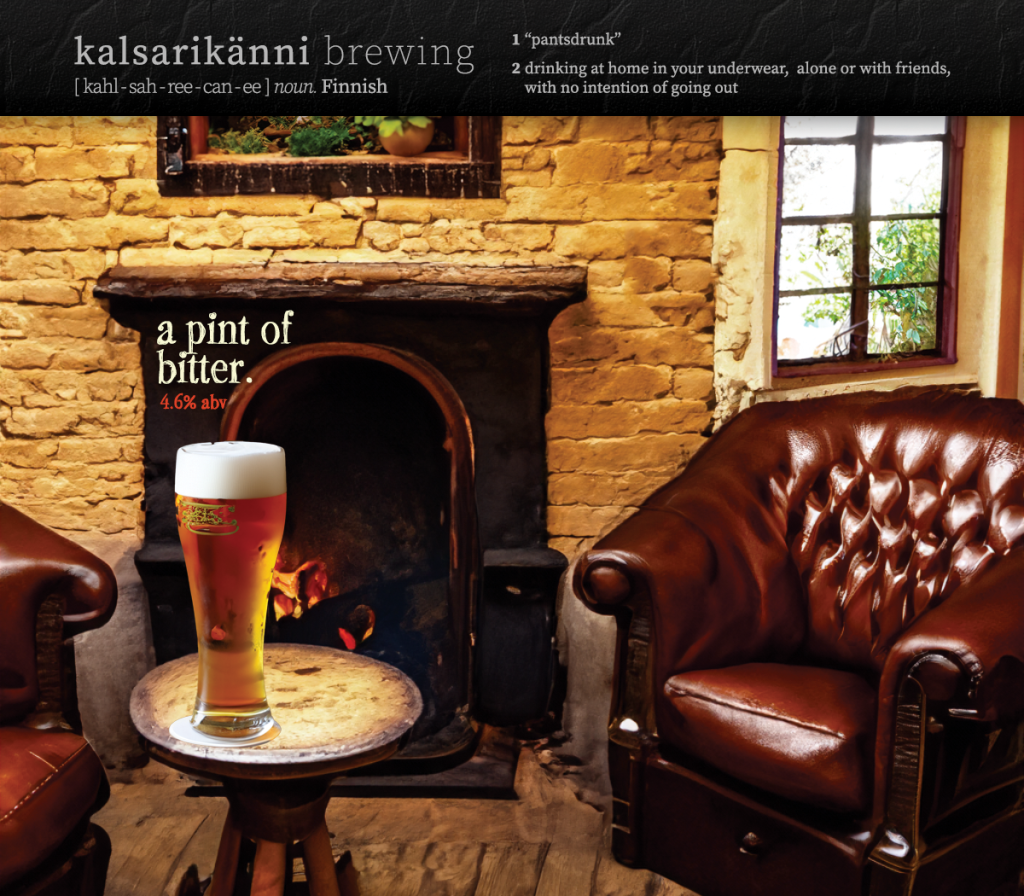
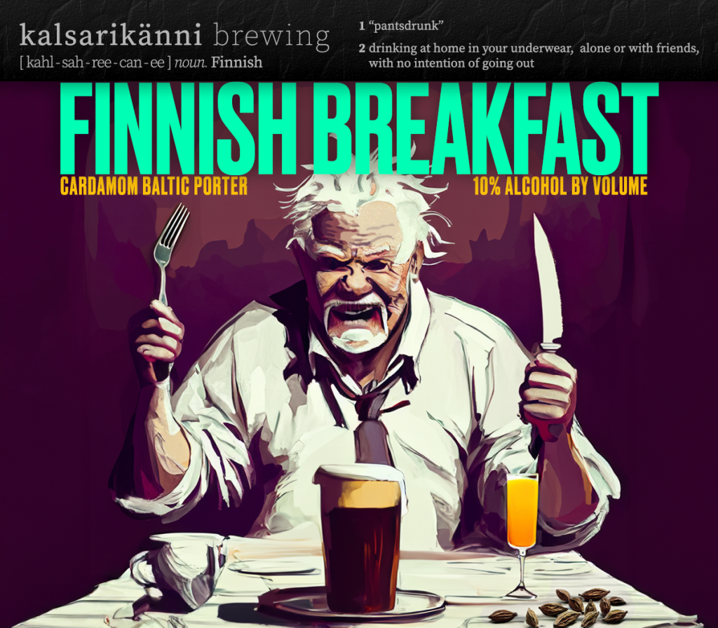
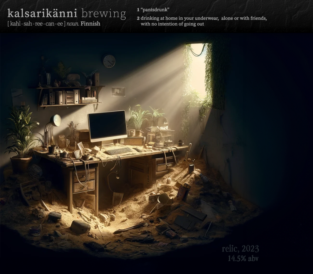
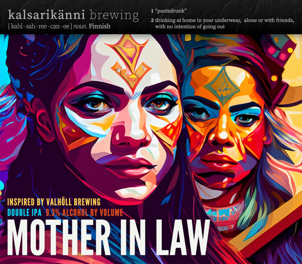
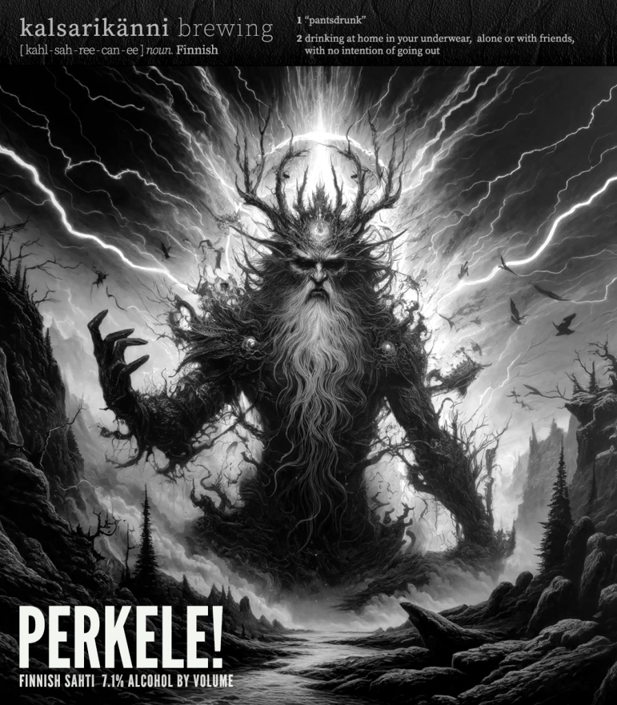
For some labels, it was fascinating to see what AI could create with very little prompting. Often I found myself needing to modify the resulting image through dozens and dozens of extra prompts — this felt like talking a six-year-old through filing a tax return — before finally arriving at a result that was close to (but still not exactly) what I was looking for. For several labels, I just used the AI-generated image as a jumping-off point: taking the artwork into Photoshop and then reworking large parts of it myself with paintbrushes and clone tools.
In the end, there are only a few of these AI-assisted labels that I truly love. When I look at them as a whole, I feel like I can see their uniformity, their artificial sheen, their soullessness. While Gen AI can create striking, colorful imagery, it often feels empty and devoid of life. In traditional art, an artist’s imperfections can add authenticity, but Gen AI’s instantly recognizable imperfections only make its art feel even more fake.
Moving forward
I’m going back to designing my labels entirely on my own, without the use of Photoshop’s generative tools. While this means I’ll be bumping up against my own limits as an artist/illustrator, I believe the results will also feel more human and more “me.”
I think that’s a very good thing.
Leave a Reply